|
Part 1
1. How do you feel after watching that video? I feel bad for her and feel that more things should be accessible for people like her. 2. As a designer, what could be done to make experiences better for Sinéad? When designing an everyday object, accessibility for people like her should always be kept in mind and applied to the final design. 3. When you think about how it is to experience life the way she does, what is that called? It is called inequality. Part 2 1. List 3 professional fields that are associated with UX design (there are more than just three) user research, product designer, user experience design 2. Who coined the now-ubiquitous term User Experience? Don Norman 3. What did he study at MIT? electrical engineering and mathematical psychology 4. What is the name of his book, and the unofficial UX Bible? The Design of Everyday Things 5. According to him, what are the two most important components of good design? how well it serves the user and its ornamental value 6. In your own words, please explain what affordances are? cues that help people understand what a product is meant to do without looking at the instructions 7. In your own words, please explain what signifiers are? signs and sounds that communicate meaning to its user 8. What are these items called? forming the goal-> forming the intention-> specifying an action-> executing the action-> perceiving the state of the world-> interpreting the state of the world-> evaluating the outcome seven stages of product design 9. One objection to his work states that streamlining a product (i.e. removing obstacles to learning) can result in a lack of consciousness about said product’s true inner-workings, resulting in what? "dumbing down" of user behavior 10. What man said: “You’ve got to start with the customer experience and work back toward the technology—not the other way around.” and why would that be important? Steve Jobs Part 3 1. 2 apps that you think have great user experience and tell me why. Think about intuition, placement of menu, use of imagery, visual hierarchy and color. 2 apps that have great user experience are Spotify and Tik Tok because they are easy to use even when you are new to the app and finding specifically what you want is very easy to do. The apps are very visually appealing with its calm and professional typography and colors.
0 Comments
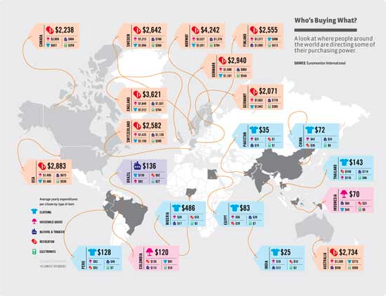
1. The purpose of this infographic is to show a graphical representation of consumer spending across the globe.
2. This infographic has all the 5 attributes of CHART. There is contrast with the map being a neutral color and the price tags being a brighter color. There is hierarchy with the most biggest item in each price tag being highlighted by being visually bigger and a color that represents it. There is accuracy with information online being similar to the information on the infographic. There is relevance with the information being recent. There is truth with the information coming from a reliable source. 3. Comparing PC to Mac, How to build a desktop PC, Steps to creating a good infographic 1. The occupation I chose was Producers and Directors, and the base salary is $79000.
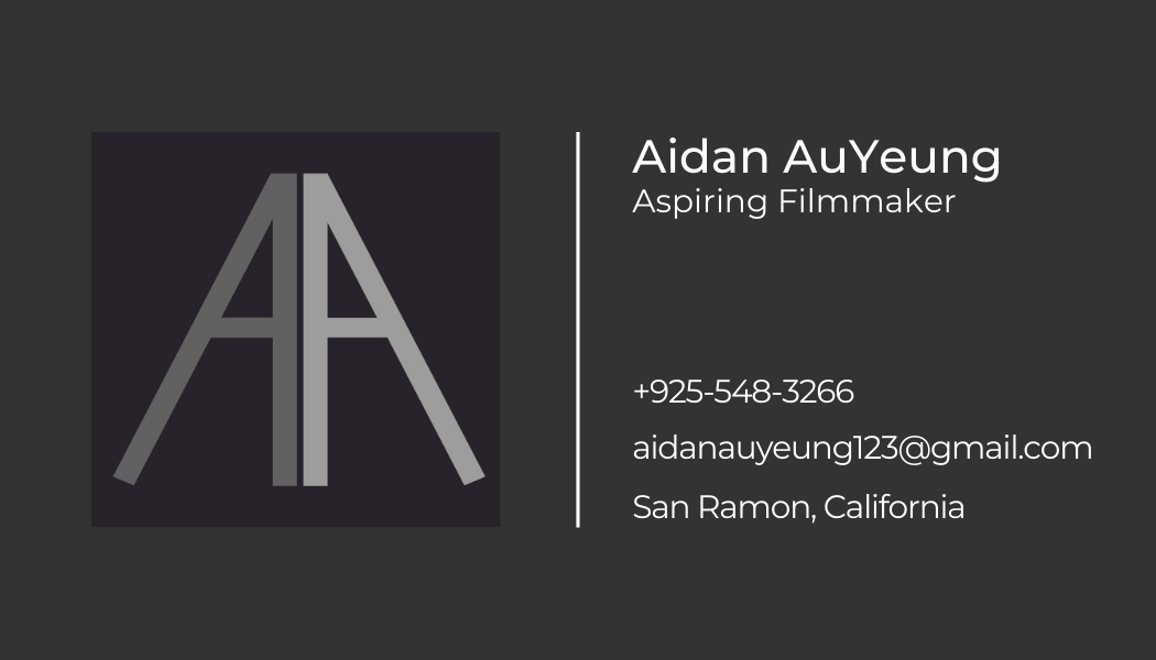
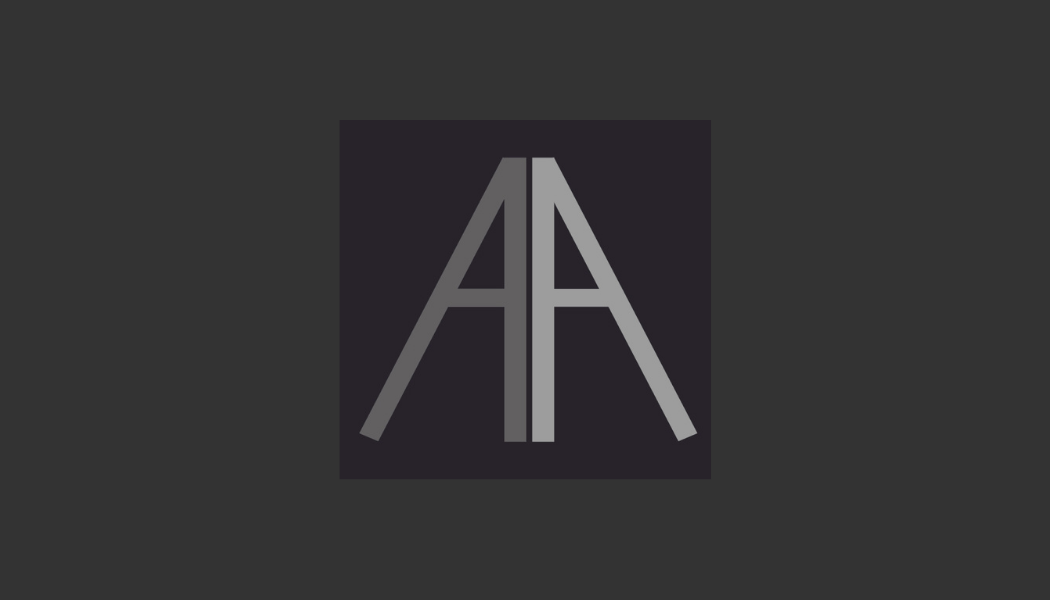
2. The state I will live in is California and my state tax bracket is 8%. 3. My Federal tax burden is $1,811.71 plus 8% of the amount over $52,455. 4. I will have $3443.52 per month. 5. After subtracting other costs I will most likely have enough money to eat but money will be tight and I will be living pay check by pay check. The job I want doesn't pay that much and after taxes I won't have enough money. 6. The overbearing taxes don't make me consider living in a different state because what I want to do is prominent in California so if I stay in California I can acquire good experiences and receive good opportunities. 7. State and federal taxes pay for roads, education and schools, military, healthcare, social security. 1. My logo reflects me because I like the way it looks. It is symmetric and has dark colors which I find very visually appealing.
2. My favorite part of my logo are that the 2 As are perfectly symmetric with each other. 3. One change I made as a result of the critique was to fix some of the lines with the letter to make it look more symmetric and cleaner. 4. Using the 6 thinking hats was easy because it allows me to easily receive feedback and I found it helpful because it allowed me to easily reflect and make changes to my logo. 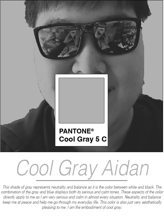 1. Something I learned was how to create a clipping mask on Illustrator and the different Pantone colors.
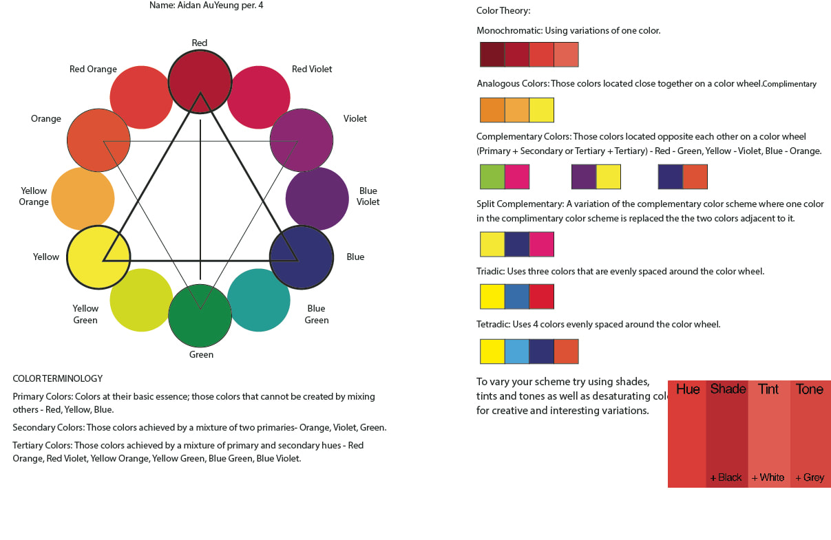
2. I was not surprised that this is my signature color because I already like this color. 3. A good complimentary color to my signature color would be black or white because those colors are very similar in tone to my signature color. 4. A good analogous color to my signature color would be pink because it is very bright unlike my signature color that is neutral.
The Spotify logo uses the colors black and green and uses a complementary color scheme.
The google logo uses the colors blue, red, yellow, and green and uses a tetradic color scheme.  1. The principles I animated are staging, straight ahead, timing, exaggeration, and appeal.
2. It was easy to use puppet wrap because it allowed me to animated the objects in the exact way I wanted. 3. I like that the characters roll to each other because it looks funny. 4. I would change the frame where they hug to be more clean instead of the objects just merging together. |
AuthorMy name is Aidan AuYeung. Archives
April 2023
Categories |
 RSS Feed
